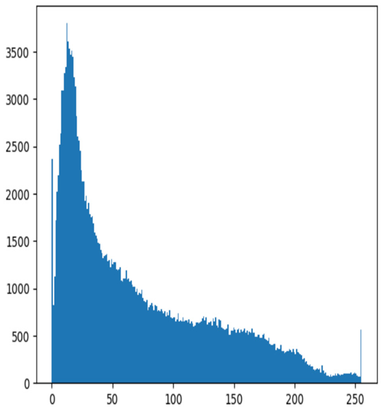
The resulting graph is as follows:

Figure 4.3 – Histogram of pixel values
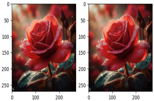
Multiple images side by side: We can use subplots to display multiple images side by side for comparison:
import matplotlib.pyplot as plt
import numpy as np
from PIL import Image
# Load two images
img1 = Image.open(‘./images/roseflower.jpeg’)
img2 = Image.open(‘./images/roseflower.jpeg’)
# Convert images to numpy arrays
img1_array = np.array(img1)
img2_array = np.array(img2)
# Plot the images side-by-side
fig, axes = plt.subplots(nrows=1, ncols=2)
axes[0].imshow(img1_array)
axes[1].imshow(img2_array)
plt.show()
We get the stunning result as follows:

Figure 4.4 – Multiple images side by side
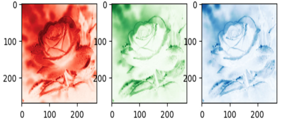
Color channel visualization: For color images, we can plot each color channel separately to see how they contribute to the overall image. In an image dataset, a color channel refers to a single component of color information in each pixel of an image. Color images are composed of multiple color channels, where each channel represents a specific color aspect or color space. The combination of these color channels creates the full-color representation of an image. Common color spaces include Red, Green, Blue (RGB), Hue, Saturation, Value (HSV), and Cyan, Magenta, Yellow, Key/Black (CMYK).
In general, RGB color channels are visualized using the appropriate colormap to represent their respective colors. When visualizing individual color channels (red, green, and blue) separately, it’s common to use colormaps that highlight the specific color information.
Here are typical colormaps used for visualizing individual RGB channels:
- Red channel: The ‘Reds’ colormap is often used to visualize the red channel. It ranges from dark to light red, with the darker values representing lower intensity and the lighter values representing higher intensity.
- Green channel: The ‘Greens’ colormap is commonly used to visualize the green channel. Similar to ‘Reds’, it ranges from dark to light green.
- Blue channel: The ‘Blues’ colormap is used for visualizing the blue channel. It ranges from dark to light blue.
Here’s an example of how you might visualize individual RGB channels using these colormaps:
import matplotlib.pyplot as plt
import numpy as np
from PIL import Image
# Load a color image
img = Image.open(‘../images/roseflower.jpeg’)
# Split the image into RGB channels
r, g, b = img.split()
# Convert channels to numpy arrays
r_array = np.array(r)
g_array = np.array(g)
b_array = np.array(b)
# Plot each channel separately
fig, axes = plt.subplots(nrows=1, ncols=3)
axes[0].imshow(r_array, cmap=’Reds’) # Use ‘Reds’ colormap for the red channel
axes[1].imshow(g_array, cmap=’Greens’) # Use ‘Greens’ colormap for the green channel
axes[2].imshow(b_array, cmap=’Blues’) # Use ‘Blues’ colormap for the blue channel
plt.show()
As a result, we see the following channels:

Figure 4.5 – Color channel visualization
